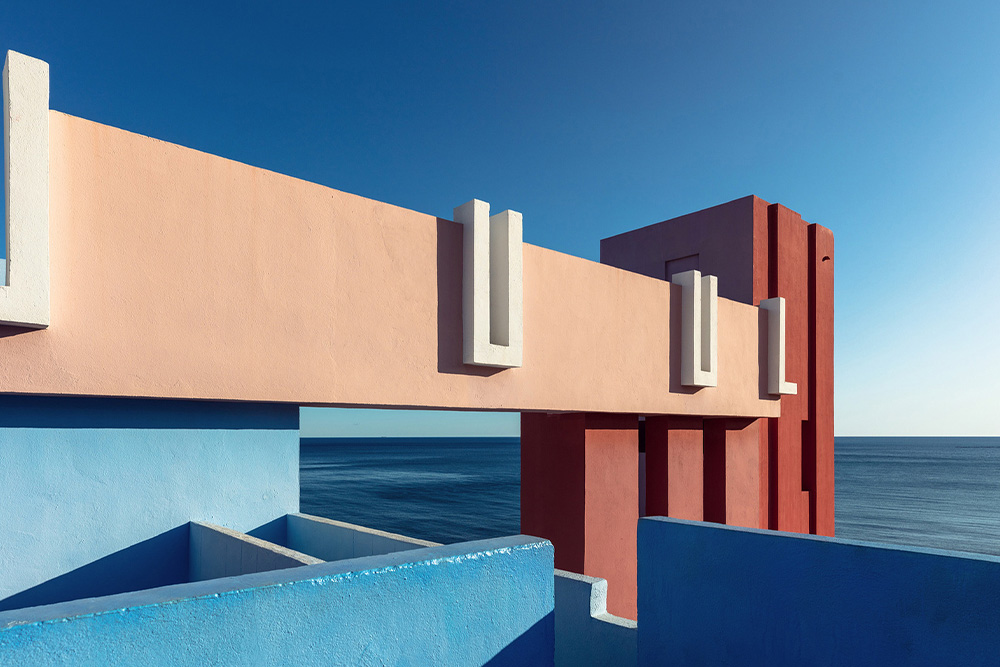
Different color tones and saturations are preferred to shape the visual and emotional experience of a space. This is an integral part of the design process and is effective in various components of a structure, including its floors, ceilings, facades, and even the surrounding landscape.
The use of color also plays a critical role in how a space interacts with its users and surroundings. Color shapes the overall ambiance and atmosphere of a space, creating desired emotional responses. The use of warm colors can evoke a sense of intimacy and warmth, while cool tones can create a feeling of spaciousness and openness. By selecting complementary and harmonious colors, a sense of unity and balance can be achieved.
In architecture, the use of color can have significant effects on how people feel both physiologically and psychologically. The color of a room or building can create a specific mood. For instance, warm colors such as red and orange can increase heart rate and blood pressure, creating a more energetic and stimulated feeling. On the other hand, cool colors like blue and green can have the opposite effect, reducing heart rate and blood pressure to evoke a calm and relaxed sensation. It is possible to create an inviting atmosphere using warm colors or establish a tranquil space with cool colors. In the following sections of the article, we will explore the emotional connotations of different colors and how they can be utilized in architectural spaces to evoke specific moods and atmospheres.
Red is an impactful
color that can evoke a range of emotions and associations. It consistently
triggers a strong instinctual response and creates an alarm effect. Therefore,
red has been used over time as the color of warning signs, traffic lights, and
emergency interventions. On the other hand, it is associated with passion and
warmth and historically symbolizes power and authority.
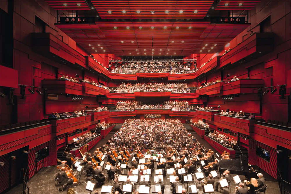
The reason for the popularity of this color in architecture lies in the effective results of these subconscious characteristics: If something is red, it draws attention. Hence, it is used to create a striking, powerful, warm, and dynamic atmosphere both indoors and outdoors.
Blue is a cooling
and calming color commonly associated with tranquility, peace, and trust,
making it popular in spaces where a sense of calm and harmony is desired. It is
often used to create a serene and tranquil atmosphere. Its strong association
with the sky and the ocean makes blue suitable for nature-inspired environments
or spaces that require a sense of openness and expansiveness, such as waiting
areas or workspaces. The feeling of trust and professionalism that blue conveys
facilitates a sense of comfort and ease for individuals in these environments.
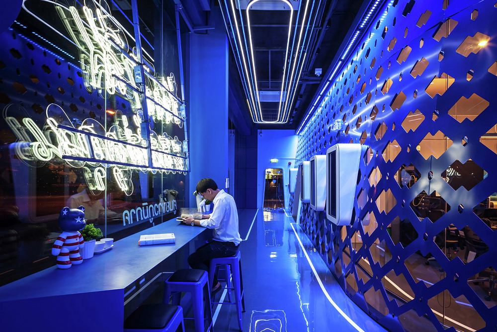
The choice of color determines and strengthens the place of the architectural project in the collective consciousness. It can be said that blue has a strong effect in this sense.
When yellow is used, it is virtually impossible not to attract attention. As perhaps the most intense color in the spectrum, yellow draws the eyes in almost any context. So, what does this color signify when used in architecture? Psychologically, yellow is often known as a color that tends to make people feel happy or lively.
It is a vibrant and
attention-grabbing color that can have a significant impact when used in
architecture. Due to its intense nature, it should be carefully selected for
the space where it will be used, as it exudes a strong presence everywhere.
While it has the ability to uplift and create a joyful atmosphere, using too
much yellow can be overwhelming and dominant.
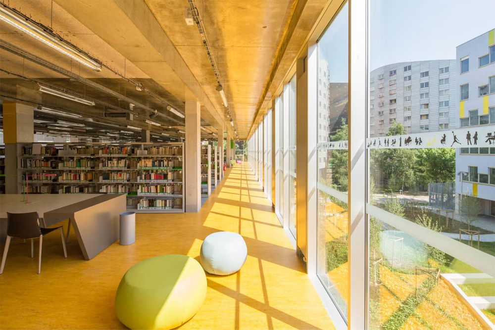
The friendly and charming connotations make it a popular choice for children's spaces such as preschools. Its brightness can instantly liven up a dull or somber space. Lighter or more orange-toned yellows, on the other hand, can offer a calmer and less intense appearance, providing opportunities that broaden the range of applications for the color yellow.
The color green
tends to be associated with a balanced and harmonious relationship, but also
with nature and growth in the broadest sense. These qualities, often considered
positive attributes, make green a popular choice.
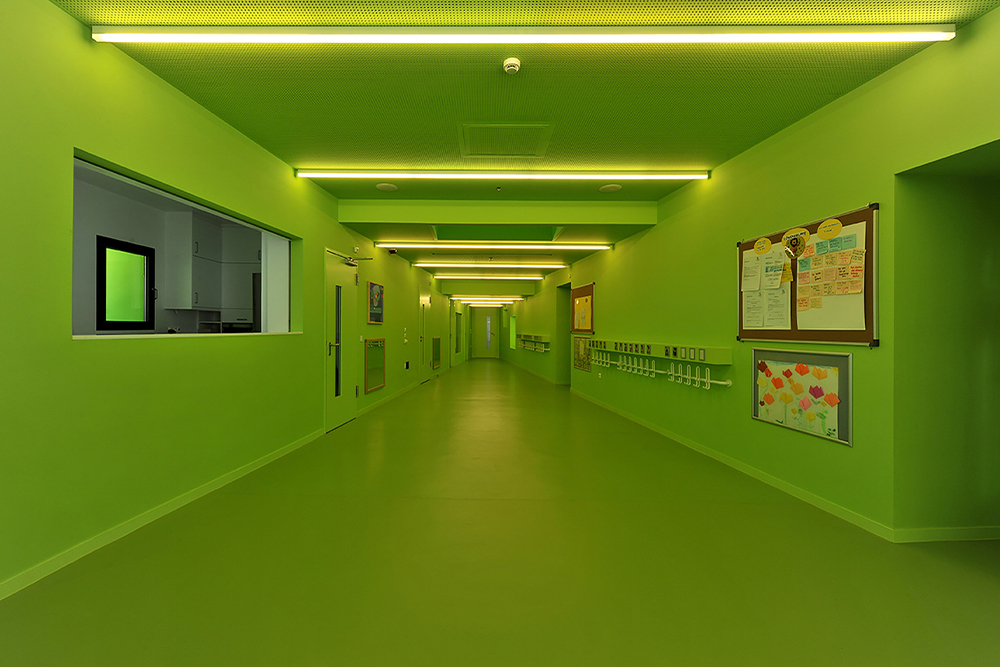
The mere pronunciation of the word carries connotations of environmental responsibility, significantly influencing our perception of the color. The use of green in architecture not only creates a serene atmosphere but also signifies environmental responsibility. Particularly in outdoor settings, green walls and green roofs can be associated with a sense of sustainability, suggesting an intimate warmth.
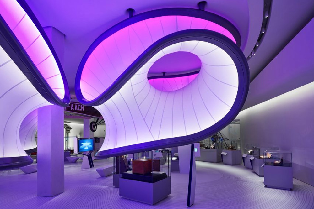
The impact of
purple is generally linked with nobility. As a strong color choice conveying
wealth, sophistication, and a sense of privilege, it can leave a lasting
impression with its striking quality. Purple, evoking a sense of luxury,
elegance, and mystery, is suitable for high-quality spaces such as hotels,
spas, and luxurious venues. While not a widely used color, when used
appropriately, purple creates a sophisticated effect and a feeling of prestige.
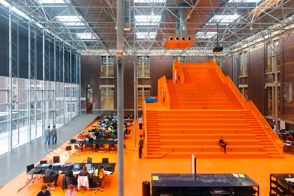
Orange is often perceived as an overlooked color in architecture,
considered either too subtle or too intense to evoke strong emotions and
highlight a space. However, this warm color has the ability to infuse a sense
of vibrant life into a place. Its association with energy and enthusiasm makes
it a powerful tool for architects, enabling them to create spaces that empower
and encourage users. Orange is less intense and more subdued compared to red,
but it still retains brightness and cheerfulness. Additionally, it can be used
in larger quantities without being overwhelming, as it is less aggressive.
Orange is a wonderful way to add warmth, liveliness, and joy to a space without
being overpowering.
Taking a quick glance at leading design publications since the early days
of modernism, one color that immediately stands out is white. White is a
frequently used color in modern architecture because it is associated with
purity, openness, cleanliness, and simplicity. Its ability to convey a sense of
minimalism and a clean aesthetic makes it a common choice for contemporary
homes and art galleries. Environments where cleanliness and hygiene are
crucial, such as hospitals, laboratories, and other indoor spaces, often
incorporate white due to its association with purity and cleanliness.
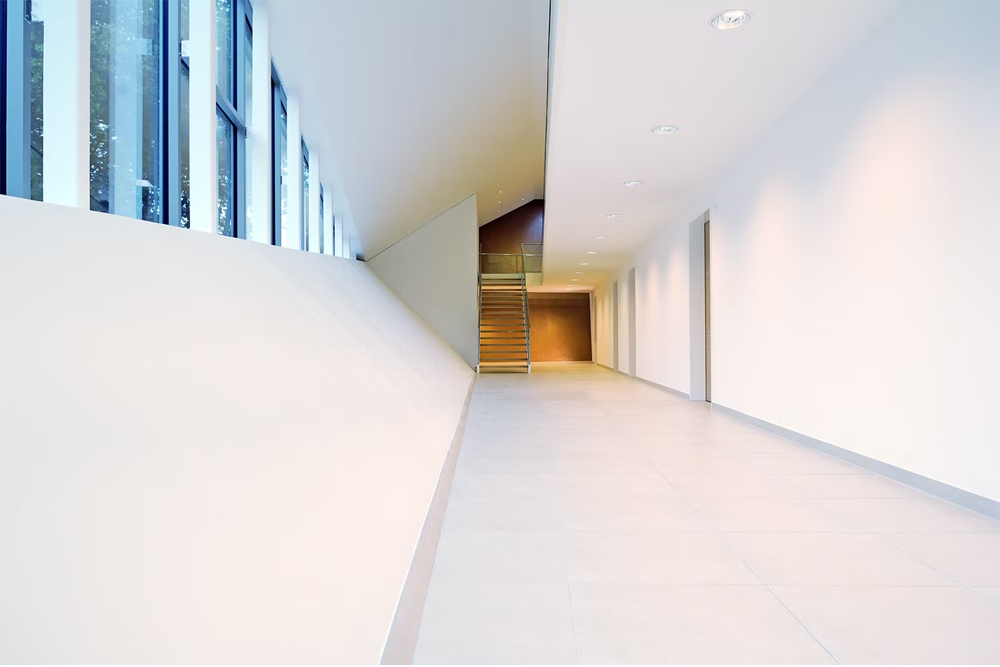
White can conceal a variety of formal gestures; when used as a background color, it can be both beautiful and nearly invisible. White can also evoke a sense of calm and tranquility, making it popular for spa areas, meditation rooms, and other spaces where relaxation and peace are essential. The use of white walls and ceilings can contribute to a brighter and more expansive appearance of indoor spaces. Its versatile applications make it a favorite choice for architects worldwide.
Black is a
distinctive color in architecture and can have a powerful impact when used in
the right context. Relatively rare in large spaces, black is associated with
power, prestige, and authority. Alongside concepts of formality and respect,
the sense of mystery and elegance created by the color black can establish a
very nuanced relationship with a suitable project. For instance, a black
exterior of a luxury hotel or restaurant can make the structure appear more
sophisticated and exclusive.
Black is also associated with power and
authority, making it a popular choice for government buildings, law offices,
and other spaces where power and authority are significant. It can convey a
sense of seriousness and weight, making it functional and suitable for certain
environments. However, careful consideration is required when using black to
avoid the negative and depressive feelings it can evoke when excessively
employed. Additionally, in areas where black is heavily used, appropriate
lighting selection becomes a critical complementary aspect, allowing for the
creation of a chic and modern atmosphere.
https://www.archisoup.com/color-in-architecture

