What are the criteria for good design? How can you create an aesthetically pleasing image? The answers to these questions are hidden in the basic principles of design. By understanding these principles well, you can create impressive and visually appealing works. Whether you are a designer, a design student, or simply interested in aesthetics in daily life, learning these concepts can help you create more impressive works.
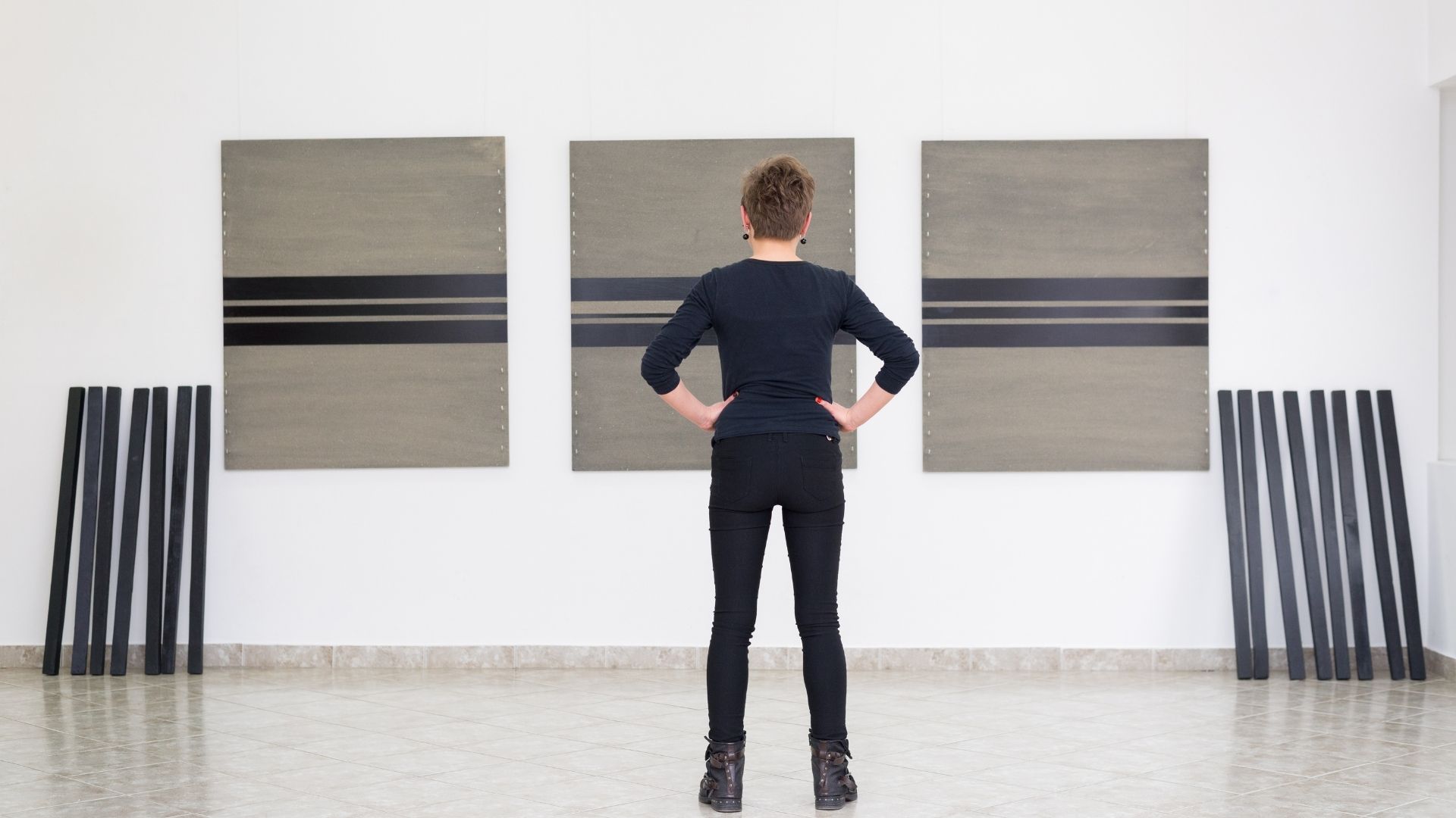
What are the criteria for good design? How can you create an aesthetically pleasing image? The answers to these questions are hidden in the basic principles of design. By understanding these principles well, you can create impressive and visually appealing works. Whether you are a designer, a design student, or simply interested in aesthetics in daily life, learning these concepts can help you create more impressive works.
Here's more information about the basic principles of design!
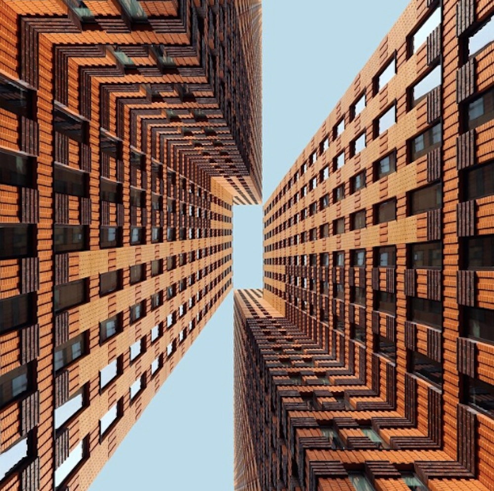
Symmetrical Balance in Architectural Photography, The Image Taken by www.anothermag.com. / © Dirk Bakker
1- Balance
Balance is expected in every aspect of life, including design. To achieve this, a layout should be created where visual weight is evenly distributed and perceivable. Design elements such as shape, color, and line can be placed symmetrically along an axis to achieve balance, or a combination of different elements with varying weights can be used to create balance through asymmetry. While both approaches result in different visual perceptions, they will yield consistent and effective outcomes in their own right.

2- Hierarchy
Hierarchy is used in design to determine the visual weight, size, color, or position of design elements in order to attract attention. This allows users to easily comprehend the design based on visual hierarchy.
Hierarchy is used to emphasize the focal point of a design. For example, in a poster layout, the headline can be highlighted by using a large, prominent font. Subheadings can be presented in smaller font sizes and different colors. This ensures that the design remains organized and legible. As a result, hierarchy makes a design more appealing, understandable, and effective.
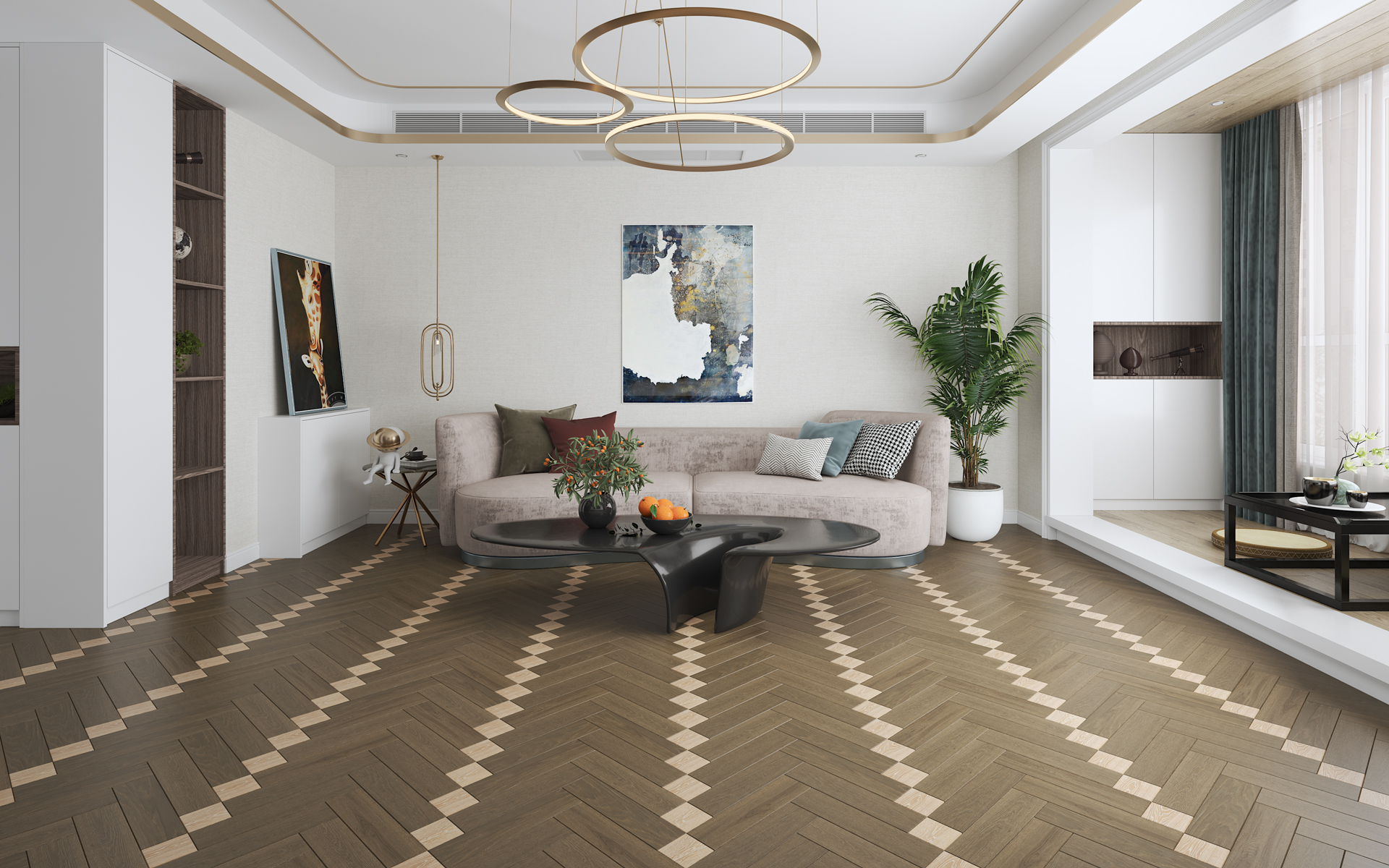
Rhythm Perception in Parquet, DENDRO Atelier Series, Model: Ktisis
3- Rhythm
Rhythm, which is an important principle both aesthetically and functionally, adds depth to the design. It is the design principle that involves the regular placement of repeated elements, creating a sense of order and establishing a specific pattern. Using rhythm in design creates visual harmony and balance, evoking a sense of regularity in the viewer or user. This is because rhythm serves as the mechanism that controls the flow and movement of a design. For example, the use of repeated colors, shapes, or patterns on a surface will create a guiding impression in the user, while altering and enriching their perception of the space. Similarly, in graphic design, evenly placed text headings or images will direct the eye along a specific path. Such characteristics highlight the significance of rhythm in design. Designs incorporating rhythm become more effective, appealing, and easily comprehensible.
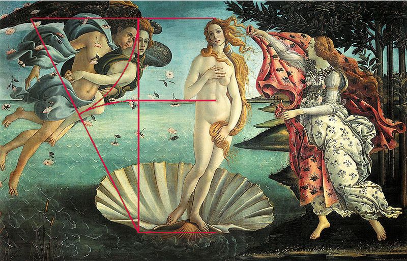
Venus, Sandro Botticelli, The image is taken from www.culturainquieta.com.
4- Scale and Ratio
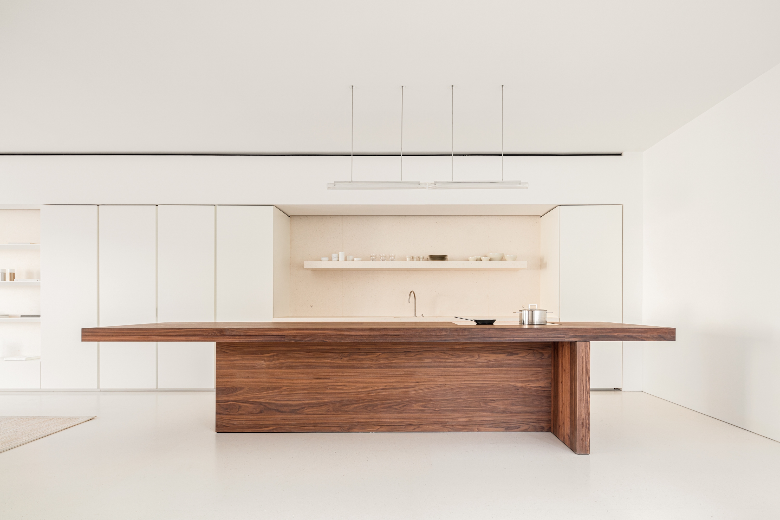
Kitchen System II, John Pawson, The İmage is taken from www.johnpawson.com.
5- Contrast
Contrast is a design tool used to highlight elements, draw attention, and create visual appeal. It allows for more effective expression of differences between different elements, emphasizing their distinctive characteristics. Contrast can be achieved through the use of elements such as color, size, shape, or texture.
Contrast is primarily used in designs to highlight focal points and differentiate elements. This allows users to quickly perceive important messages. Additionally, color contrast can be used to enhance the visibility of focal points in a design.
Contrast is also an effective method in interior design. By combining contrasting colors or forms, exciting and appealing atmospheres can be created. Proper use of contrast will establish focal areas within the interior space, allowing for the creation of unique areas that avoid monotony.
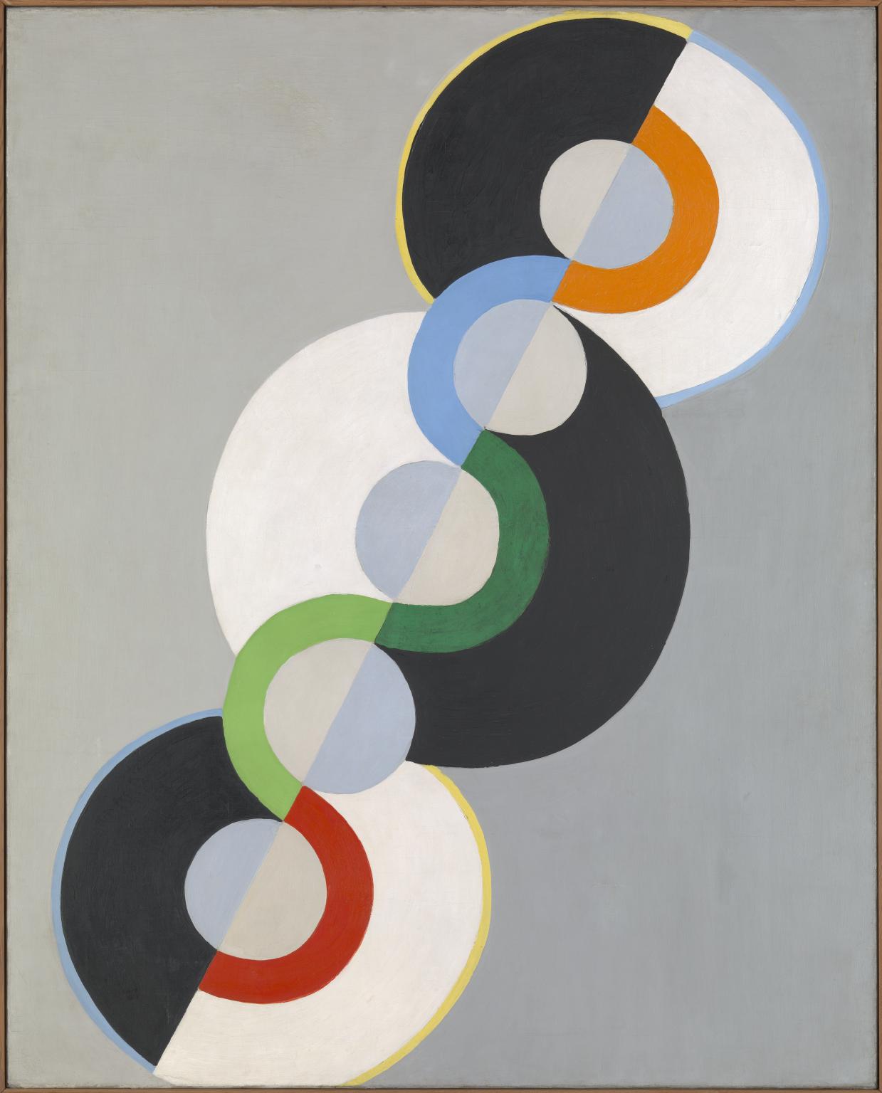
Endless Rhythm, 1934, Robert Delaunay, The image is taken from www.tate.org.uk.
Design is an art and communication form that combines various factors to deliver effective visual experiences. One of the most important design principles that shape this form is harmony. Works that possess harmony achieve design integrity and balance.
When colors, shapes, typography, negative space, and other elements come together cohesively, they create a harmonious and consistent work. This results in an aesthetic and professional appearance. Furthermore, harmony creates a sense of unity in the viewer or user, making them perceive the design as a cohesive whole.
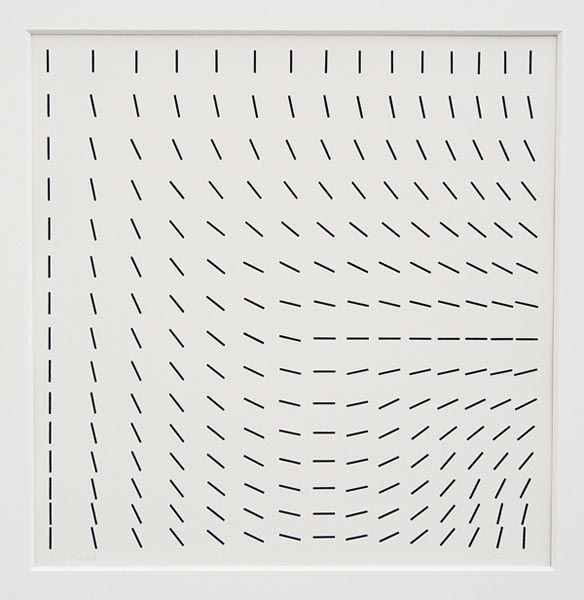
Hartmut Böhm, Principles of Systematics and Magnetic Fields Studies, The image is taken from socks-studio.com.
7- Movement
Incorporating movement in design can captivate the attention of users and facilitate a connection between the viewer and the artwork. Movement is a design principle that adds an emotional dimension to the design, creates a flow between elements, and establishes a visual hierarchy.
Viewers can immerse themselves in the flow of motion trail works. Motion creates stories between the starting and ending points, demonstrating the calming and soothing power of the artwork.
Furthermore, animated graphics and motion graphics are increasingly being used in recent times. This allows for complex information to be more easily understood, as users can comprehend visual content more effortlessly.
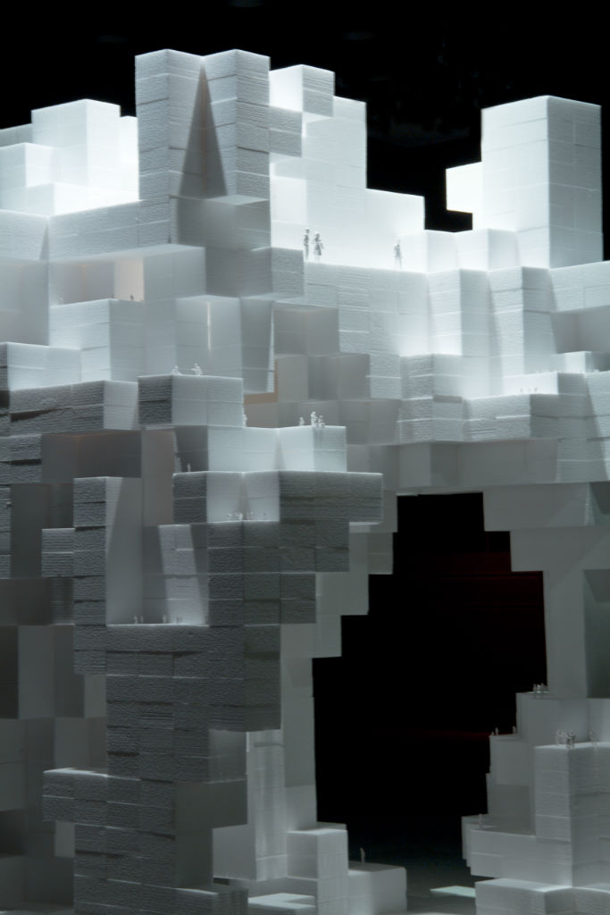
Space Game, Hiroshima MOCA, The image is taken from sourceorganizationnetwork.blogspot.com.
8- Space
"Space" is an essential design principle that provides room for elements to breathe and creates balance. It plays a critical role in both the physical and visual components of a design, enhancing readability and perception.
Well-balanced whitespace improves the aesthetic value of a design and enhances the user experience by improving content legibility. A harmonious balance in the design prevents visual fatigue and facilitates user focus. Space serves as the breathing channel of a design. Leaving sufficient space between elements helps to avoid a cluttered or overwhelming appearance.
By using space correctly in design, a professional, elegant, and contemporary look can be achieved. It allows the story of the design to stand out, enhances the aesthetic value of the design, and improves the overall visual experience.
These basic principles of design are the most effective tools to ensure that a design is both effective and aesthetically pleasing, as well as functional. By considering these concepts and principles, designers can create creative and appealing designs. Similarly, for those seeking aesthetics and functionality in their daily lives, understanding these concepts will provide a better visual experience.
Incorporating these design principles into our workplaces and homes, where we spend most of our time, can enhance our quality of life. You can also benefit from the design power of DENDRO engineered flooring products, which reflect the impressive power of design principles in your home or workplace. Check out their website at https://dendro.com.tr/en.